InsideTracker
Healthspan Category Icon Redesign
Brand Identity Development, Visual Design, User Experience
Overview
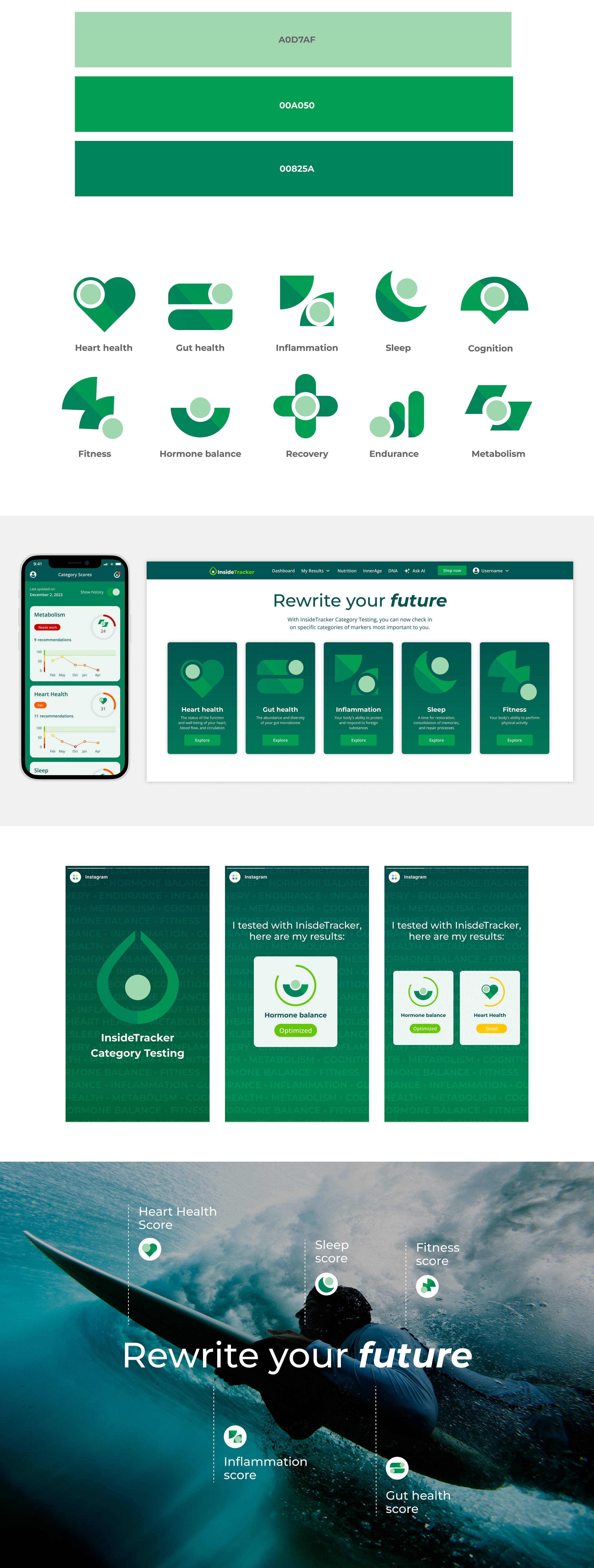
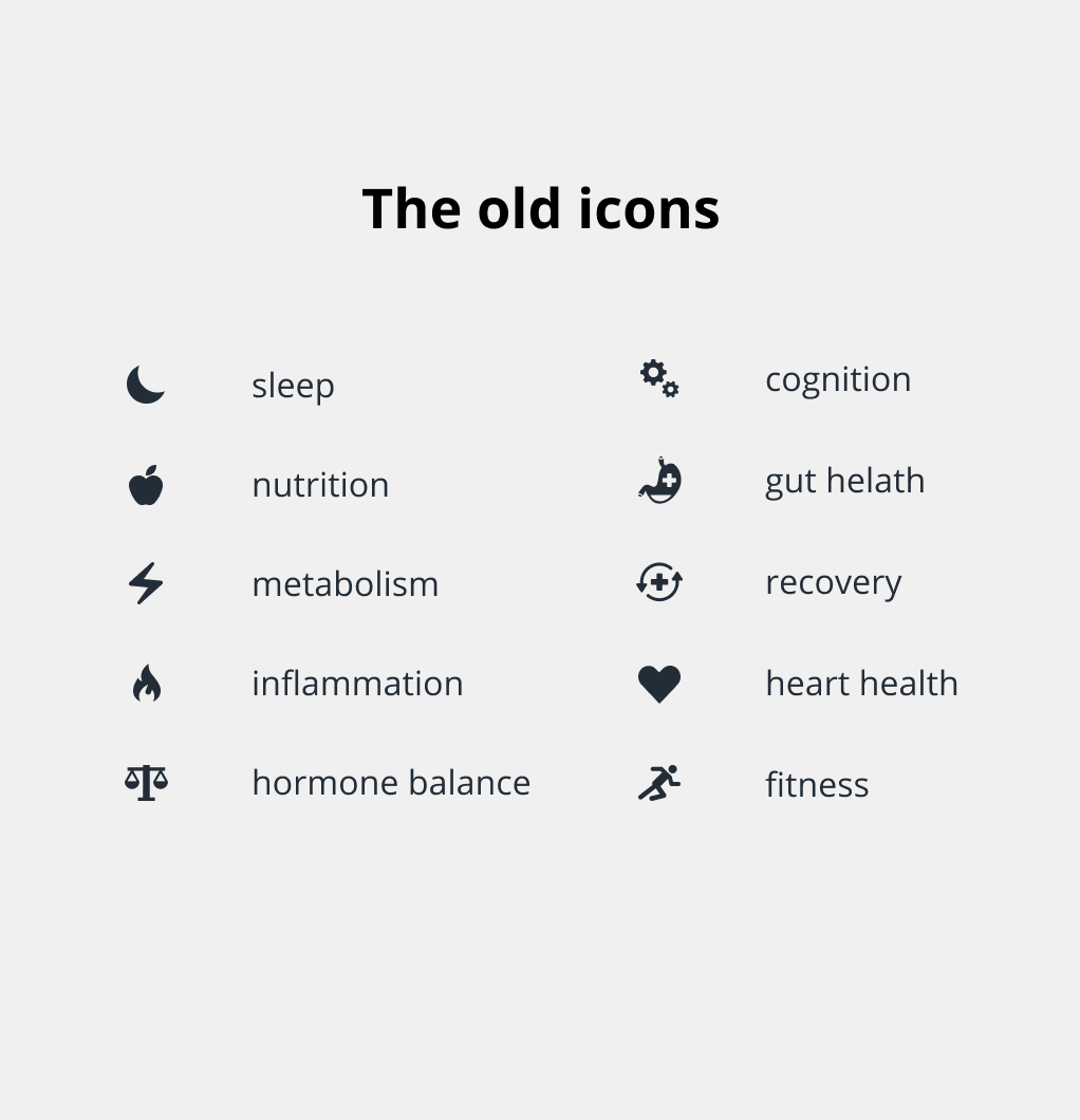
InsideTracker’s Healthspan Category tests are a foundational part of how users navigate insights, understand recommendations, and tie their personal data back to meaningful outcomes. We introduced them early in 2024 to our members to allow retesting at a cheaper cost. However, the original icon set felt generic, inconsistent, and visually disconnected from the InsideTracker brand.
I led the redesign of the full Healthspan icon system to create visuals that were unique, modern, science-forward, and instantly recognizable as InsideTracker. The goal being to enhance both usability and brand trust.
Build a Distinct, Ownable Visual Language
Many of the existing icons resembled common stock graphics used across the wellness industry. My goal was to move away from generic symbolism and create an icon family that InsideTracker could truly own—supporting long-term brand recognition and consistency.
The new icons
Shape Language
I built the icons around a consistent geometric grid, ensuring they:
Feel harmonious as a set
Scale effectively at small sizes
Have consistent stroke weights and proportions
Brand Personality Applied to Icons
The new icons embody the brand’s tone:
Scientific - clean, sharp lines in the color sets
Human-centered - rounded edges for approachability
Modern - minimal, purposeful detail
Differentiated Without Being Distracting
Each icon is unique enough to stand apart from generic industry visuals, but minimal enough not to compete with data or content.